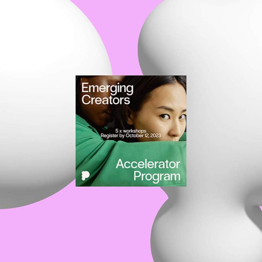
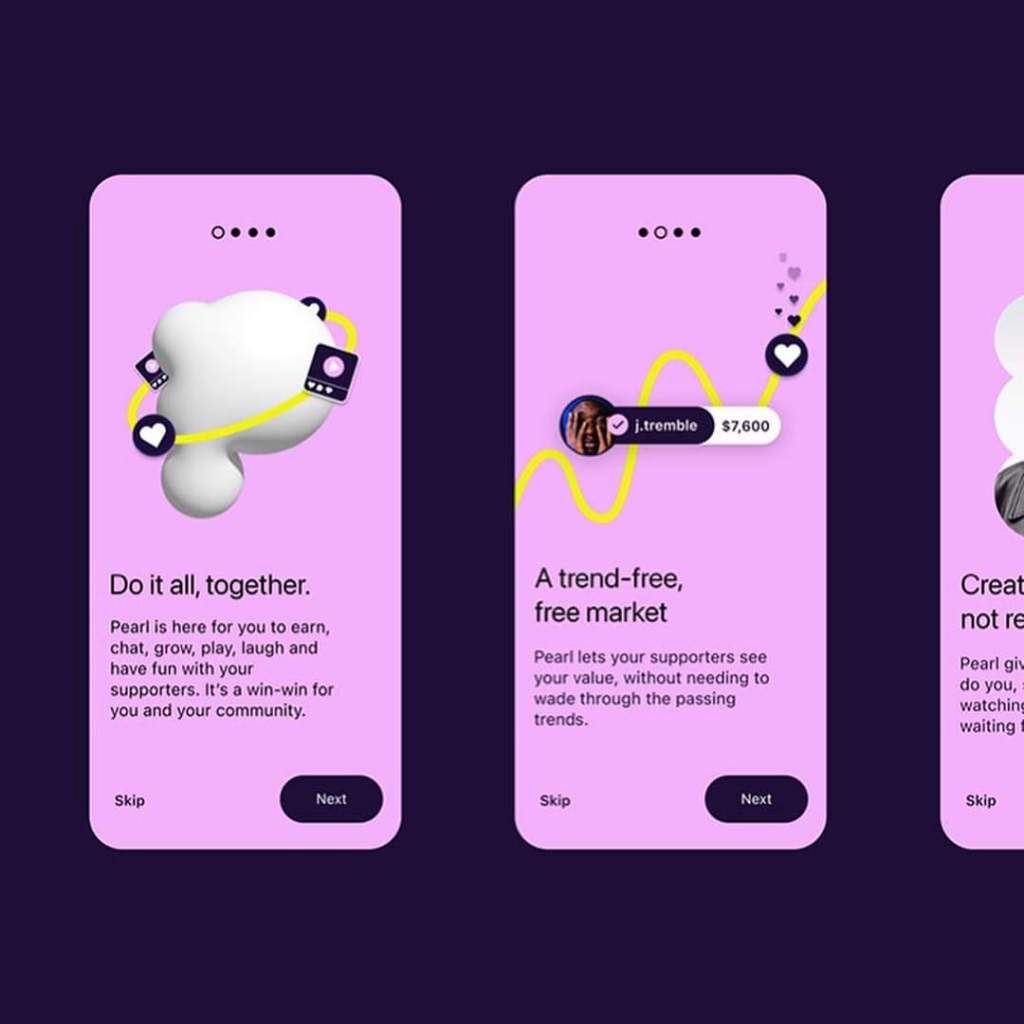
a Web3-inspired social platform, is transforming the digital sphere by empowering creators. The intent behind Pearl is commendable, striving to give creators the autonomy to focus on genuine creativity, rather than succumbing to the influence of advertisers and the tyranny of algorithms. In a digital age dominated by advertising, Pearl stands as a beacon of hope for unadulterated creativity.
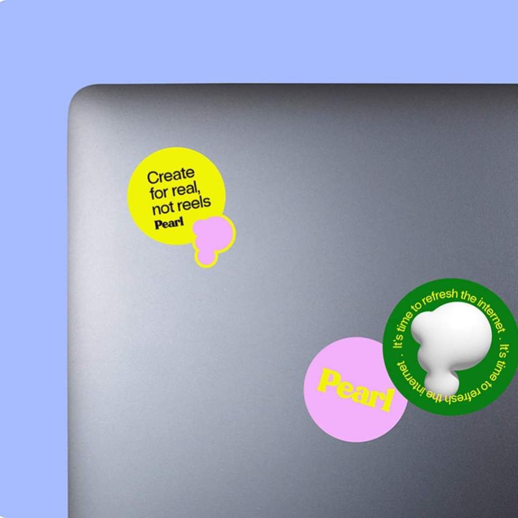
The design team at Kallan & Co took on the challenge of encapsulating Pearl’s ethos into its branding and visual identity. The outcome was an identity that resonates vibrancy and a celebration of the symbiotic relationship between creators and their patrons. The design philosophy adopted was both intentional and strategic. Aware of the limited brand exposure once users delve into the app’s interface, the team emphasized crafting an indelible and simplistic logo mark.
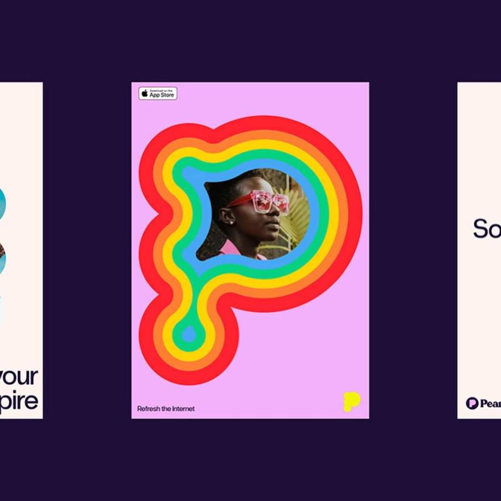
What makes Pearl’s logo exemplary is its inherent flexibility. At its core, it’s crisp, clean, and oozes professionalism. Yet, it doesn’t shy away from embracing playful nuances when the context demands. This duality ensures that while the logo stands firm in professional settings, it can seamlessly adapt to more light-hearted scenarios. In essence, it’s a mark that dances gracefully between the realms of seriousness and play, reflecting the platform’s commitment to genuine creativity.
.
@kallanco
.
#abduzeedo #visualidentity #branding #brandidentity